What is up with the film projector emoji?

OK, I’ll admit it; I’m a middle-aged person who loves using emoji. It tickles me to string them together like one of those endless German compound nouns to convey to my spouse the happy news that our cat pooped inside the litter box this morning, instead of right next to it, as she frequently likes to do for mysterious kitty reasons of her own. (I rendered that as 😼💩📥🎉, in case you were wondering.)

But I’m also a media archivist who gets really 😡 at representations of film and video technology that betray a profound ignorance of the actual objects and devices they’re standing in for. Case in point: good ol’ Unicode symbol number 2175, the film projector emoji. Where do I even begin with how much wrong is packed into this little bundle of pixels? Well, first, let’s look at it in context, as part of the “light & video” symbol cluster:

The “light & video” emoji group, including variants for different browsers and operating systems. Via emojipedia.org

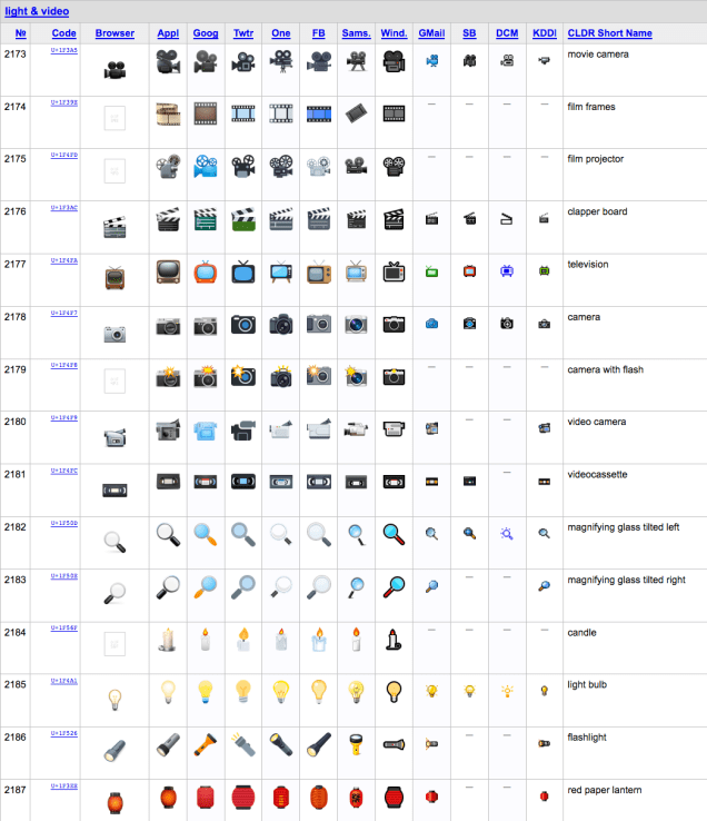
This grouping is actually quite lovely and poetic, I think. From the red paper lantern and the candle to the still camera with flash and the movie camera, it encapsulates a thousand-plus years of human experimentation with light as a technology and a tool, light as a force we’ve harnessed and made portable and learned to write with. It’s a cluster of symbols that tells a story about how we gradually gained our independence from the coming and going of the sun, and began to cast and keep our own shadows. That’s decidedly headier stuff than my litter-box news flash.

Taken individually, though, some of the little dingbats in this category get my dander up. They’re off — in much the same way that Dürer’s rhinoceros is off: they seem to have been rendered by someone who’s, like, totally heard of that thing they’re drawing. Maybe they even saw a picture of one at some point, a while back. But they sure as shootin’ never saw or touched one in person!

(If you can’t remember what a rhino really looks like offhand, either, look here.) Rhinos may have themselves some ashy knees, but they don’t have actual SCALES. There are similarly serious anatomical anomalies present in the movie camera, film frames, and video camera emoji. I can’t fix every one of the world’s problems, so I just fixate on the film projector.

First and foremost, there are marked differences between each of the variants. One or two of them seem to be at least vaguely informed by the aesthetic of late-mid-century 8mm projector models. Others look more like someone just hot-glued a couple of film reels onto a VHS camcorder and said “Ta-da! Behold, a film projector!” (Yeah, I’m looking at you, Twitter.) That’s like me putting a lampshade on my head and saying “Hey, everybody, look, I’m a lamp!” Not a single one of them appears to have been drawn from observation, and none of them would actually work.

The one that comes closest is the Apple version featured at the top of this post, which kinda-sorta, in a five-beers-into-an-evening-and-feeling-magnanimous way, looks like a Bolex 18-5 regular 8mm projector.

As the Airstream Bambi is to recreational vehicles, so the classic Bolex “toaster” is to domestic film projectors: Born in 1961, round, smooth, shiny, silver, and OMG totes adorbs!

Image swiped from the very wonderful Bolex Collector site

(This lady knows what I’m talking about. She gets it.)

Let’s compare them and talk, first, about what this emoji DOES get right, because I am into positivity:

Presentation1

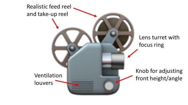
It’s…not terrible. The feed and take-up reels are the most realistic-looking of any of the emoji projector icons. The feed reel even has something that resembles film on it! The lens is pointed in the right direction, if you’re assuming this is the side of the projector that the operator stands on. The focus ring is the proper cylindrical shape, too, not flared like the lens hood on a camera (as literally all the other versions have it). There are some flourishes like the height adjustment knob that really help sell this icon as being anatomically correct to a passing glance, too.

Bolex_18_5

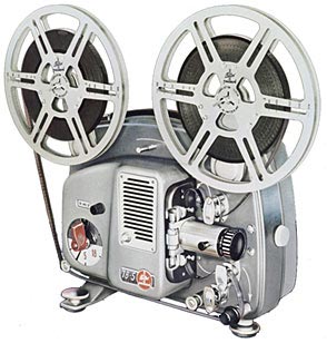
But compare it with a real Bolex, like the one above, and it’s easy to see that this emoji projector couldn’t possibly work! For one thing, the reel arms are ON THE WRONG SIDE. There is no way that film traveling from the feed reel to the take-up reel would pass between the lamp and the lens on the emoji machine as illustrated. The ventilation louvers would be on the TOP, adjacent to or above the lamp housing (which is absent here), not below it, because…duh, heat rises. The proportions are pretty off, too; the projector body is nowhere near the size it would need to be to house the drive motor and lamp. Lastly, how is there a height adjustment knob and a focus ring, but no on/off switch? What do you run this thing with, The Smart Clapper?

With the possible exception of the Facebook and WhatsApp projector emoji, which get an honorable mention for actually showing — correctly! — the film traveling from feed reel to take-up, all the other emoji projector icons are even more preposterous. All but the WhatsApp one inexplicably depict the take-up reel as being smaller than the feed reel. While it is physically possible to put a takeup reel on your projector that’s smaller than your feed reel, any projectionist will tell you that’s a great way to end up with your last couple hundred feet of film tangled up on the floor. Some of them have the reels just sort of floating in the air, not attached to anything; the ones that have visible arms are at weird angles, and wouldn’t fold in to be flush with the projector body. The EmojiOne and Samsung versions really look like camcorders — not film devices at all, but video ones. (The Samsung reels look suspiciously like EAIJ open-reel video carriers, not film reels, too.) On the EmojiOne and Microsoft icons, the feed and takeup reels actually overlap. At best, they would grind together as the projector ran, which is horrible to contemplate. As to the Google one…not only is it outlandishly proportioned, with an enormous flared lens hood that’s as big around as the larger of the two reels bizarrely floating atop it, like slices of lemon on the edge of a glass of iced tea, but the poor thing is facing the wrong way.

Why do these persnickety critiques matter? Well, for one thing, they tell me the same thing that Dürer’s rhino does: That the person creating this image has never looked closely at one of these creatures in real life. (If we look at the plant or animal emoji clusters or even the food icons in a few years, will those be unrecognizable, too, thanks to accelerating extinction, or a population-wide transition to Soylent-based diets?)

It also affirms that there is a growing distance between analog and digital technologies — one which sometimes leads the latter to make superficial representations of the former. Often, this is in the spirit of homage, or it comes from a desire for footage to “look old” again after archivists have lovingly cleaned and restored it to its best possible state. Other times, it just seems random or lazy. (I loved, and recommend to your attention, Ashley Blewer’s close read of the fake media glitches in Beyoncé’s Formation video.) But while Dürer lacked meaningful access to the exotic creatures of his time, we live in a much more connected age — emoji designers should be able to find plenty of pictures of film projectors to study, even if they don’t have a friendly film archivist near them who can lend them a life model. If you’re an illustrator who wants to help me right this wrong, drop me a line! I’ll hook you up with some beautiful, functional gear to render truthful likenesses from, and we’ll heal this small broken piece of the symbolic world.

Ah, but a student’s reach should exceed their grasp, or what’s a syllabus for?*

*With apologies to Robert Browning.

Among the many lessons it took more years of college than it should have to sink in, I count learning to read a syllabus as a work of scholarship, and of scholarly authorship, as among the most important. I can point to one professor in particular who helped me see this. They had published relatively seldom since getting tenured, but taught with great dedication. This professor’s syllabi often ran to dozens of pages, and formed (rightfully, I think) the intellectual work of which they were most proud. Those syllabi included not just impeccably formatted reading lists and a week-by-week breakdown of topics and assignments, but concise and comprehensive guides to writing for scholarly audiences, pithy discourses on the core subject matter of the class, detailed descriptions of assignments and their exact delivery parameters, and other elements. The syllabus helped make clear how much effort they’d put into preparing to teach the class–all of which, in turn, tacitly conveyed how much effort we students could expect to put into learning in it.

Prior to that class, a syllabus was just a handout I picked up from the stack by the door on the first day, tucked into the pocket of my five-subject notebook, and checked once a week (usually the night before class, if I’m being honest) to see what the assigned readings were. The syllabus was how I would know if I had to pull a paper or project out of my…ahem, pocket for the next meeting. After that class, I had a new appreciation for what the syllabus could teach me before we’d had a single class meeting: in between those lines, I started to see more of who my professors were, where they might be coming from, and what they might want to give to or get from us as students.

If you’re about to become a student again, especially if you’ve been out of school for some time, syllabi can make for very interesting and helpful reading. (And, unlike many other forms of scholarly publication, you can often access them for free even if you don’t have academic library privileges.) As you evaluate and compare different graduate programs, looking over the syllabi for the core courses and some of the electives that sound interesting can deepen your sense of whether the program will teach you things you want to know, or need to get where you want to go professionally. Reading a syllabus or two can give you a sense of which professors you might want to work with as advisors and mentors, or talk to during a campus visit. I have met very few scholars who wouldn’t perk right up and start chatting if you mentioned you’d read anything they’d written and found it interesting. (We’re human and we have hearts, after all, and much of the time we feel we are just crying into the void.) If you can’t access one of their articles, look for a recent syllabus instead!

If you’re a student now, devote time to reading the syllabus for every class you take, and learn sooner than I did how many things a syllabus can be to you: A road map, a red flag, a portrait of the professor, a guide for future study…the list goes on. One dilemma I talk through a lot with students is how to choose which classes to take. The graduate program I teach in is only two years (which goes by fast). Our university is a large one, our program is highly interdisciplinary, and our students have the option of taking multiple courses outside the department, but course titles and catalog descriptions only convey so much. I always suggest that they look at the syllabus for a class they’re considering if it’s already posted, or email the instructor directly to ask for a copy if it’s not. Professors may be working on their syllabus right up until the last minute, of course, especially for a new class–but they may also have a course outline or draft version they’re happy to share if it helps interest people in the class and ensure minimum enrollment. If you have to choose between two classes you’re keen on–maybe they’re scheduled at conflicting times, maybe you’ve only got one elective slot open this term–having the syllabus for the one you don’t end up taking means you’ve got a reading list for self-study, or the makings of a proposal for an independent study or guided readings with the same professor in a future term, when your calendar’s less crowded, or when you’re better prepared to tackle the advanced content.

Sometimes, you might just be able to tell from looking at the syllabus that a class is not for you. This can save you untold amounts of time and emotional energy. What’s your gut reaction–does it make you curious or fill you with dread? Does it seem like it will be helpful for you to have this perspective on this topic (whether or not you agree with it)? Look at the reading list: dates, authors, article titles, journals, page numbers. Will this be new material for you? And is it new material, period? A course on 19th century literature or medieval systems of law should still introduce you to at least one or two 21st century ideas about those subjects, not just hot takes from the 1980s.

Universities are dynamic environments, so (in my opinion) syllabi ought to be living documents, reflective of that dynamism. I can’t imagine using a syllabus essentially unchanged year after year, when each iteration of a class I’ve taught before offers a chance to refine the readings, retool the assignments, and reflect the current state of our knowledge. There are always new scholars or more timely examples to cite, and tweaks to make for in-class exercises based on the successes of the last time around. (And the failures–because sometimes things just don’t go that well, which is one of the most important ways teachers learn while they’re teaching.) A very good question to ask a professor if you’re talking to them about their syllabus is “What have you changed from the last time you taught this class?”

Looking back on my own syllabi, I’m reminded of the many changes I’ve made from one iteration of a class to another. For instance, I’ve altered course content and classroom strategies significantly just based on who’s enrolled in a particular class. A class of all first-years is really different from a mix of first- and second-years (especially in the fall quarter, when the first-years are just getting on their feet and the second-years are already thinking ahead to graduation). New students need those classic, foundational texts for context, but the more seasoned ones have already read them (and possibly talked them to death already!) in core classes. I’m often on the lookout for “compromise” articles or chapters to assign in these cases–ones that do a good job of summarizing the classic texts with which they’re in conversation, but then move quickly into new territory. When I’ve had a large number of students from other departments or programs, they’ve had similarly varied needs and capacities to take into account. If I know I’ll have an interdisciplinary contingent in a class, I might add “further reading” selections to help fill in foundational knowledge from our program’s core courses, or to help connect the assigned texts to parallel scholarship in their field(s). I’ve also learned that when you increase a class size from one dozen to two or three, the group dynamics will change a lot, and the syllabus might need tinkering to suit. Those “introductions” you do on day one could now eat up a whole hour of class time! Depending on how you plan for students to work together and interact throughout term (are there group projects? service learning components? discussion sections? field trips where carpooling will be helpful?), taking that full hour at the start to get to know one another might be really worth it. On the other hand, you might want to structure and moderate the introductions so they cover only the essentials and move more quickly than conversationally.

Speaking of moderation–although they’re works of scholarly authorship, syllabi aren’t created as standalone works, but as frameworks and stimuli for intellectual exchanges. I’ve learned that conscious framing of readings and other class activities helps students understand why they’re important enough to be on the syllabus. “We’re spending class time on introductions now, and on project check-ins at midterm, because you’ll be paired off for discussion exercises in almost every class meeting, and forming small groups to work more closely together on your term projects. You’ll benefit more from the input and experience of your classmates if you know them better, and I’ll be able to offer you more individually and as a group if I have a sense of where you’re all coming from.” Or “We’re a big group this term, but I want us all to be more than vaguely familiar faces to each other. I’m going to ask each of you introduce yourself with your full name, what department, degree program, or campus unit you’re affiliated with, and one thing that you’d really like to get out of this course. I’ll write those goals on the board as we go–if  someone ahead of you says the same thing you’re thinking, you can just tell me to add a plus-one to any of them to save time.” I’ve also started asking, as part of discussions about readings, the simple question “Why do you think I assigned this article/chapter/book/movie/activity for this week?” The answers students have to this question have been really insightful–sometimes revealing connections and underlying course themes that hadn’t occurred to me. And the question itself is a form of critical practice, a reminder that even when there’s an established canon of literature in the field, we still make choices about how we teach and learn from that canon.

Now, after over a decade of teaching classes of my own, my Zotero library has folders for resources related to each class I teach regularly. I can toss new things I run across in there as I encounter them, and add them to the mix when it’s time to teach that class again. (Formatting updated reading lists and putting additional recommended readings up on the course web site is also easy-peasy with a citation manager. If you teach or do research of any kind, and you don’t use a citation manager already, you should.) Other updates range from an ongoing effort to diversify and decolonize the literature I assign and the examples I cite in lectures, to making classroom policies on device use, and even the formatting of the syllabus itself, more inclusive of every kind of learner. Each edition of a syllabus thus reflects that term’s particular grouping of students, the changes in our dynamic profession, and my evolution as an instructor. I even have folders for imaginary classes I’d like to teach someday–each a little seed packet of literature, out of which I’ll eventually cultivate a fully ripened syllabus!

As I continually write and refine syllabi, I have also continued to read them as documents in new and different ways. Teaching as part of an accredited degree program means my syllabi are in conversation with others, and with all the teaching being done across our community of scholars and practitioners. Often, I’m consulting other syllabi as companion works for my own. Knowing what’s come before in sequential courses can help me ensure continuity, or account for shifts in practice over time. I look at my colleagues’ syllabi each quarter to minimize redundancy and reinforce connections between my class and others that might be taught the same term. I also read syllabi for inspiration and ideas. Other people’s syllabi reflect their unique take on a subject–and frankly, it’s easier for me to skim a syllabus and still engage meaningfully with its content than to read a dense journal article by the same author. (Sometimes that’s my cheat if I want to have some basis for interacting with a colloquium speaker or a visiting scholar I admire when I don’t have time to read their latest book. Now you know my horrible secret.) They introduce me to ideas and literature I wouldn’t have found on my own. I’ve borrowed–with permission and acknowledgment, naturally!–the most effective language and useful features I have found in my teaching colleagues’ course documents. I’ve gladly shared bits and pieces of mine in turn, especially with professional faculty who are new to teaching.

And of course, I read them to remember what it’s like: To be a student. To be learning. To be walking into a classroom on the first day, maybe a little bit nervous, but definitely excited. To be getting ready for my future, at least a little bit of which is mapped out on the pages of the syllabus I’ve just picked up from the stack by the door.