Conferencing is an acquired skill! Especially if you’re an introvert, and the very idea of tooting your own horn to strangers in a hotel ballroom full of noise and while trying to eat something for the first time since breakfast gives you hives. No one is born knowing how to do it, though. After 20-odd years of attending and presenting, during which I have accumulated an impressive collection of lanyards and nametags, I have also learned a thing or two about How To Conference.
It’s been my pleasure to share that knowledge with others, especially students and emerging professionals who might be conferencing for the first time, so that they can feel comfortable from Day 1 and get maximum value out of what can be a very intensive, expensive, exhausting, and transformative experience
Last year, I updated my classic “Conference 101” talk to address the unique (and for a lot of us, very new, and not a little intimidating!) environment of the virtual meeting. You can find the recorded version online here. (Note that the actual session starts after two minutes and 30 seconds of silence. Call it my tribute to John Cage.)
And, because this learning process is ongoing for all of us, I’ve recently updated that session with Conference 201, just in time for AMIA’s spring online conference! That new version incorporates the accumulated wisdom of a year of convening via Zoom with colleagues around the world. Slides are here (PDF), and the recorded version will be available online soon!
– Geoffrey C. Bowker, Memory Practices in the Sciences
“What you will see from these presentations is policing at its rawest,” said LAPD Chief Charlie Beck at a press conference about the agency’s new Critical Incident Video Release practice. In their first such presentation, LAPD Public Information Director Josh Rubenstein describes Critical Incident Video Releases as offering a comprehensive anthology of evidence from investigations in progress:
“Our community briefings will show you physical and digital evidence, including photographs of the scene, pictures of any weapons recovered, audio recordings of 911, radio transmission recordings and video footage from our body-worn and digital in-car video system.”
Critical Incident Video Release NRF031-18 was released to the public via the Los Angeles Police Department YouTube channel on June 20, 2018. It showed footage from a May 6 encounter between a 24-year-old man and LAPD officers in the department’s Newton Division, near Exposition Park. The video release was praised as a step forward for a police department that was quicker to adopt bodycams than it has been to make the resulting video recordings available to the public. But the video was also critiqued for its slick production values, fragmentary depiction of the event, and potential to only show officers in the best possible light.
The NRF031-18 video itself, as well as the new policies that led to its creation and release, illustrates several points raised by the Community and Culture working group at the OTRATT National Forum meeting in 2016. Among them are the difficulty of controlling how people perceive video (both as an objective, neutral record of “what actually happened,” and as a record that can be ambiguous, inconclusive, or easily misread) and the newly urgent need for media literacy on the part of both public information officers and public viewers of police video. NRF031-18 also demonstrates how difficult it will be to make ethical, effective new video evidence policies that support increased transparency and accountability for law enforcement.
First, let’s talk about the content of NRF031-18—which, considered quantitatively and critically, makes a pretty weak case for showing “policing at its rawest.” The 17-minute release contains only about 4.5 minutes of bodycam video and 911 call audio. That’s only 0.15% of the “nearly 50 hours” of video reportedly collected in relation to the incident, (most of which will likely never be released to the public). The minute or so of 911 call and police radio dispatch recordings seem to be substantially complete; at least, no edits are apparent to the ear, and none are referenced onscreen or in the introduction to the audio. This impression of completeness is further reinforced by continuous on-screen transcription of the calls over a visual background of uninterrupted—but almost certainly unrelated—audio waveforms.
The transcript of 911 call audio appears on a background of audio waveforms. The fine blue line (just between the W and h in “What’s”) travels from left to right as the audio plays. Mismatch between the audio playback and the waveforms shown suggests that this image is likely generic visual “wallpaper,” not the waveforms of the actual recording.
The body-worn camera footage, however, is heavily edited, with gaps between segments ranging from a few seconds to several minutes in length. Some of these cuts are indicated by onscreen text; others are described verbally by Alan Hamilton, a Commander in the LAPD’s Force Investigation Division, whose narration and framing of the edited bodycam video segments comprises most of the remaining 12 minutes.
Some edits in the bodycam video footage are signaled by onscreen captions; others are described in the narration.
People are, by nature, credulous about what they do see, and suspicious of what they don’t. Police may redact footage or withhold it from public release for good reasons: to protect subjects, to ensure due process. But withholding and redaction also, inevitably, fuels speculation. An unexplained gap of a few seconds is enough to spark conspiracy theories about “what THEY don’t want you to know.” This tendency to obsess over the unseen is present with all forms of redactable evidence, but it’s particularly potent with video evidence—and we’ve actually known that for decades. In their 1979 book Videotape on Trial: A view from the jury box, Gerard Miller and Norman Fontes discussed results from several studies examining the use of taped testimony and trials and their influence on juries:
“We observed that when jurors knew material was edited, they speculated about its content, an activity that might be even more biasing than knowing what the excerpt contained and being instructed to disregard it.”
Were those missing 30 seconds of bodycam video cut because they were unremarkable—a mere continuation of the exchange as we had already seen it? Or maybe because a local resident, not involved in the incident, happened to walk in and out of the camera’s view, and cutting the segment in which they appeared was the easiest and most effective way of protecting their privacy? Or perhaps because the officer or the man he was addressing used profanity? As it is, we can only speculate; however, the briefest of onscreen notes about what the excerpted material contained could smooth over that gap very effectively, while providing additional transparency about departmental policies on redaction of video prior to public release.
This clip is identified in the upper right corner as being from the passenger officer from the first car to arrive at the scene. Other clips show different ID camera ID numbers, and the same camera ID also appears without the “PASSENGER OFFICER” notation.
Next, let’s look closely at what happens within the video frame. The first segments of bodycam footage shown are verbally and visually identified as being from the passenger officer in the first patrol car to respond to the 911 call. While Hamilton does not ever mention that footage from any other officers’ body-worn cameras is being shown, the ID numbers visible along with the embedded timecode in several other video segments in the edited package suggest that viewers are seeing footage from at least three different bodycams.
This clip does not include the timecode area or camera ID in the upper right corner, and may have been cropped from the full-frame video image (see below).
Several other segments of video have the timecode area cropped out entirely. This may have been done to focus more closely on areas of interest within the frame, but the cropping itself is never acknowledged in narration or with onscreen text, and the visual quality of the cropped video is consistent enough with the uncropped images that a casual viewer easily may overlook the absence of the embedded timecode and ID numbers.
Above: Uncropped, full-frame video from a second officer’s bodycam. Below: Comparing the corresponding area of the full-frame image (left) with the cropped image (right), and the relative positions of features like the officer’s gun butt and the palm tree trunk in the left foreground, suggests that they’re from the same camera source.
And speaking of timecode: None of the camera clocks are set to the local time (PDT). While the times shown on different camera views are fairly close to one another, the individual cameras’ timestamps do not appear to be synchronized. Events described as occurring earlier in the chronology of the event are marked by at least one camera with a later time than events that occur later in the narrative and are shown from a different camera view. Although most of the narration describes the events in sequence and with fairly precise timing (“six minutes later,” “after approximately 32 minutes of trying”), Hamilton also says that “at some point during the interaction” Chavez picks up a flower and holds it out toward the officers. Inconsistency among timecodes makes it much harder than it should be to confirm that the released video clips fits a clear event timeline; by the same token, the specificity possible when working with timecoded digital video makes any vagueness or ambiguity in the narrative about what happened when far more noticeable.
Non-incident footage that appears in the video includes officers putting on their chest-mounted bodycams and images of the less-lethal force weapons used by LAPD.
Turning to the narration used throughout much of the piece, it becomes clearer how most of NRF031-18’s impact as a tool for transparency comes not from the bodycam footage itself, but from framing and interweaving that footage with specific details about the technology and procedures being used by police in this incident. Hamilton notes that the two officers who responded to the 911 call were both equipped with chest-mounted bodycams. Later, he describes the “low ready position” the passenger officer uses when he draws his gun, and reiterates that the chest-mounted camera perspective might create a misleading impression of where the gun is pointed. Hamilton describes, and the video shows, the Remington 870 shotgun and beanbag rounds used in the department’s “less lethal” force protocols. As the officers close in, Hamilton describes the “arrest team” and enumerates its members’ designated roles (from controlling arms and legs to using lethal force, if necessary), and explains why the officers use two sets of handcuffs to restrain the man after they Taser him and bring him to the ground.
That narrative is not strictly informative, though. It’s also descriptive of the footage to come: “You are going to see him try to communicate with [the suspect],” “you may not be able to see the actual angle of the officer’s weapon is not directed at the suspect’s body at this point,” “here you’ll see him spit in the direction of nearby officers.” It’s Presentation 101—tell them what you’re going to show them, show them, then tell them what you showed them—but it’s also Persuasion 101—tell them what they’re going to see, and you might convince them to see it. This approach can create the impression that the footage can’t simply speak for itself. (The tradeoffs inherent in presenting ambiguous or hard-to-decipher footage, with or without comment, are something to address in a later post.)
Visitors to online news outlets that covered the Critical Incident Video Release are directed to the LAPD YouTube channel to watch the video. It can no longer be viewed as an embedded feature.
Finally, a few thoughts on the mechanism of the video’s release, and the ethical dimensions of that decision. NRF031-18 didn’t drop as hard as the surprise release of THE CARTERS’Everything Is Love the previous week, but local and national press outlets still covered it and featured the LAPD video in online stories. Those links no longer work as embedded features of the news stories, though; instead, potential viewers are redirected to the video on LAPD’s YouTube channel, where comments on this video have been disabled. Steering viewer traffic toward a single, verifiable source (rather than allowing clips to auto-play directly from embedded links) and disabling comments at that source helps contain the spread of violent and disturbing imagery. It also greatly minimizes the amount of politically-charged rhetoric generated by the video and about its subjects, and permanently associated with it online.
“Maybe it would be better if a neutral third party did the editing so that LAPD couldn’t be accused of bias in deciding what to keep and what to cut.”
A truly neutral third party would likely be difficult to find in any city — let alone one with such long-standing tensions between police and the public, and with so many experienced film editors looking for work. However, the OTRATT Culture & Community group did also question whether the public might see a meaningful difference between civilian and sworn personnel’s stewardship of video evidence—and whether other city agencies with a higher level of public trust, such as municipal archives or public libraries, might effectively collaborate with police departments to provide reliable preservation and access to evidentiary media.
The group also discussed how core competencies of the public information officer in the bodycam era now include critical media literacy—that is, the ability to understand the complex nature and many limitations of video evidence, and video as a format. Public information officers must pay close attention to what material they’re putting out, and how; they must be attuned to how standard operating procedures and accepted practices come across on camera; and they must be able to anticipate how editing or redacting footage (regardless of its source) will impact public perceptions of trustworthiness and authenticity. NRF031-18 was heralded as a major, if early, step in the LAPD’s effort to increase transparency. This is fair enough; a major city police department releasing any case-related video within just a few weeks of a use of force incident that ended in a man’s death really should contribute something to that aim.
But we must also read this carefully crafted package of clips and context as an attempt to shape truth perceptions, as well as a necessary move to better inform the public about specific aspects of law enforcement practice and procedure. If LAPD (or other departments who take this approach over releasing unedited or minimally redacted footage) are not sufficiently transparent about their joint aims of making incident records public while teaching viewers “more about the department and policing as a whole,” they will undermine both efforts significantly. Like so much other data, the NRF031-18 video is raw only in the sense that a sashimi platter is raw: it presents for consumption a lot of little pieces that were selected, cut up, and artfully arranged by chefs who are doing their best to avoid any heat. At some point, if you do enough slicing, you really have to call it cooking.
Over the years I’ve created a number of resources I share often with students, colleagues, and mentees. Most of them relate to professional development, self-assessment, and job-hunting; all of them are tools I use myself, not just things I tell other people to do. I’m gathering them here, for convenient reference, in a single post — one that you can bookmark, and that I can update and add to as I develop new resources. All links will open in a new window, and are to PDFs unless otherwise noted.
2019 was a year of major changes for me! I left my position at UCLA in late June, after seven years of (award-winning) work with the Moving Image Archive Studies MA program and the Department of Information Studies. The good news is, I won’t miss out on teaching–which was one of my favorite parts of my old job. I’m still actively involved with the AMIA Continuing Education Task Force, which is developing a new slate of webinars for the coming year that we think will be valuable to our professional community, whether you’re new to the field or a mid-career or senior professional looking to build skills. I will also be teaching a course on Preservation & Digitization of Audiovisual Materials for Louisiana State University’s iSchool, which is so exciting–an opportunity to work with a whole new community of students and present course material in a new format via their distance-learning platform!
I’m also very busy these days with a range of project-based and freelance work. In late 2019, I joined the founding team of Myriad Consulting. We’ve been stunned at the response so far, to be honest–requests for proposals keep coming in, and they’re all from unique and wonderful places! We’re gratified to have this confirmation that there’s space in the marketplace for a small, nimble, and multi-disciplinary team to assist in meaningful ways with the needs of public, corporate, and private collections. Most of all, I love the variety; I’m getting to use skills and knowledge from every phase of my career to date, and I’m learning a lot as a go, too! It also feels meaningful to me to be helping people with their most pressing needs. It’s a hustle, for sure–a lot of plates to keep spinning–but I’ve always said that LIS professionals can and should be entrepreneurial with their skill set, and now I’m putting my words into action.
I’m also excited to be working on the AMIA Diversity and Inclusion Fellowship Pilot project, and helping AMIA move forward with a proposal for additional funding to expand their work on recruiting and supporting new professionals who are more representative of the communities we serve and the collections we provide access to.
It’s a lot! But it’s never so much that I don’t have time for you if you’re someone who’s in search of advice, information, or assistance as you consider your options for work or study in the LIS field. My old UCLA email address is no longer working, but you’re welcome to reach out via Twitter (my DMs are open), LinkedIn (I’ll happily add you to my network if we’ve worked together on a job site, project, or committee), or regular ol’ email or phone (contact info right here on this site!). When I was just starting out in this field, so many people welcomed me and were generous with their time and expertise–I always appreciate the chance to pay it forward.
On Monday, November 26, I returned to work from the long holiday weekend and found in my inbox an email from Dennis Doros, AMIA Board President, notifying me that they were suddenly and unexpectedly without a keynote speaker for the upcoming AMIA conference in Portland, OR. They very kindly asked if I wanted to step in and deliver some remarks to my colleagues that Thursday morning instead. This conference was deeply meaningful to me — AMIA has been my must-go professional gathering since the first time I attended in 2001, and it happens that my very first AMIA was also held in Portland. Seventeen years later, I was being offered the chance to return as director of the MLIS degree program I’d only just graduated from back in 2001, and to deliver a speech that would help welcome a new generation of students and first-time attendees as warmly as I was welcomed then (by colleagues like Stephen Parr, Bill O’Farrell, Sam Kula, and Alan Stark, all of whom are sadly no longer with us). I said yes, of course, and delivered the following remarks — which might have been longer, but not necessarily better or more heartfelt, had I more time to prepare them.
*
Transcending the national: Some thoughts on becoming a community of practice
As I think most of you know, Fackson Banda couldn’t be here today, as originally scheduled, because of visa issues and international travel restrictions. On Friday afternoon, during the Further Freaky Film Formats session, I’ll be pinch-hitting for another colleague, Stefanie Zingl from the Austrian Film Museum.
She had hoped to be here to speak about the short-lived Mroz Farbenfilm technology, but her application for travel funding was approved only last week—too late for her to make arrangements to attend in person. It’s upsetting when these things happen, because these people are part of our professional community. Their voices are the ones we wanted to hear this week—not mine, speaking in their place. The imposition of other regimes—geographical, bureaucratic, political, or financial—on their ability to come home to us feels wrong.
Communities of practice are groups of people who share a concern or passion for something they do and learn how to do it better as they interact regularly.
The regular interaction with others to deepen our knowledge and broaden our perspectives on areas of shared concern is a definitive aspect of the community of practice. Our own Ray Edmondson, who will be deservedly honored this week with AMIA’s first Advocacy Award for his decades of work to unite the global community of media archivists, also touched on this in his consideration of us as a profession.
A profession is a field of remunerative work which involves university level training and preparation, has a sense of vocation or long term commitment, involves distinctive skills and expertise, worldview, standards and ethics. It implies continuing development of its defining knowledge base, and of its individual practitioners.
And Terry Cook may have put it best and most succinctly when he spoke of archives, and the archive, as a foreign country. At times like this, when geopolitical boundaries are encroaching on our archival ones, I especially feel the truth of this—that we are a nation unto ourselves, and negotiating our sovereignty.
I am confident that the folks in this room who have taken my Intro to Media Archiving and Preservation class at UCLA will also have picked up on the reference in the title of my talk to Caroline Frick’s book Saving Cinema. But even if you didn’t do the assigned readings (and yeah, I know who you are), you can see that the unit of observation in her account of film preservation’s social and political history is the nation. As I thought about what I would want to say in this venue, and how national origin and being from somewhere in particular is one of the things that still dictates whether or not one could participate in our community of practice, it seemed the me that we are, together, writing a new chapter in this history. We may be trying to move beyond the national, or perhaps to become a nation of our own—not foreign, as Cook would have it, but familiar, and familial.
So let’s look at what makes a nation: Language. Culture. Shared history. Systems of governance and social order. A common currency and a shared identity. And a national anthem, which I think it’s safe to say we now have!
As to language: We speak our own. To the uninitiated, it is a Babel dialect comprising mainly acronyms and words with all the vowels taken out. Is this Hebrew? Or Italian? or Welsh? (Come on, ffmpeg has to be Welsh for something.) The only way to really learn it is through immersion, it seems, and like all languages, it’s evolving and changing all the time. Whether or not they did the readings in my class, I think every media preservation student I’ve taught will remember my insistence that they be conscientious in their use of the words “film” and “video”—which are so often used indiscriminately, and whose specificity are really important in the context of our work with moving images. And these images do move, across and around the world!
But when I think about how these images move, I also think of home movies—many of which were, paradoxically, shot far away from home, by vacationers and missionaries, emigres and refugees, over the last century or so. Projects like the international Home Movie Day event and the work of regional archives that collect home movies and amateur films have helped us see that the “home” in home movies refers not to our domestic environments, but to our home planet, this earth where we live. We are most at home in the foreign country that is this archive.
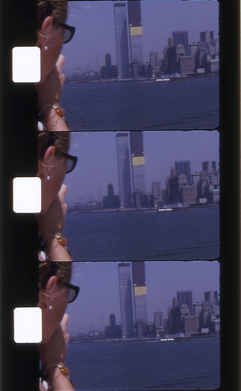
The World Trade Center towers under construction, 1969. (From the Bradburn family home movies, screened at Home Movie Day in LA, 2004).
We are also citizens of a land where time matters both a lot less and a lot more than the rest of the world. Our work bridges the past and the present; I like to say that film archivists have one foot in the 19th century and on foot in the 22nd. In fact, the technologies we use today have their roots in not just photography, but the artistic experiments of the 16th century, and the scientific advances of the 17th and 18th centuries, and the optical toys of the 19th, and ideas like neuroscience that emerged in the 20th.
The critical affordances of all of these earlier media and tools of creation and understanding reverberate in the digital capture, storage, manipulation, and transmission methods we use today, and are working to preserve into the next century.
As we do so, we sometimes exceed our own boundaries. Our knowledge of what to do and how to do it, while always growing, is necessarily incomplete. Venues like the Orphan Film Symposium and the Bastard Film Encounter are where we consciously explore no-man’s land—try to decide what to do when our maps and methods are insufficient for dealing with the materials we encounter in our collections. We can—and do—take pictures of everything. Must we save it all? The exploitative pornography, the documentation of experiments on animals? The creepy footage of women’s feet and the Army’s “dental cripples” and developmentally disabled children—all shot without their knowledge or consent and then shared (in the latter cases, at least) with audiences of medical professionals? What about the inscrutable, taped-off-the-television VHS compilations of a queer teenager, growing up closeted and confused in the Midwest? The myriad fragments of censored material that someone put on a reel a long time ago, and that just seem innocuous now? What about the merely mediocre and the entirely too typical? What laws govern the nation where material like this comprises the national cinema? We’re still figuring this out, and we’re doing so as a community of practice.
Connecting is easier in a networked world. That’s as true for our data, our shared standards and descriptive practices, as it is on a human level. And that is a major argument for us to continue strengthening our capacity to allow virtual presence and telepresence. AMIA wasn’t the only organization that struggled this year with unexpected difficulties getting scheduled speakers to where their conference was being held.
But part of why we are here today because we also, and still, value being in one another’s actual presence. We value the ability to touch the same object with our hands that someone else touched with theirs. We value the act of eating a meal together, of raising our glasses in a toast to one another. We revel, too, in digging through the trash for the things that can still be salvaged; in fact, you might call that our national pastime. And of all people, we are the people who most understand the power of sitting together quietly in the darkness, our eyes all turned to the bright light we see before us. My country, tis of thee! We are AMIA, and in the words of our new national anthem, we are saving the world one frame at a time.
OK, I’ll admit it; I’m a middle-aged person who loves using emoji. It tickles me to string them together like one of those endless German compound nouns to convey to my spouse the happy news that our cat pooped inside the litter box this morning, instead of right next to it, as she frequently likes to do for mysterious kitty reasons of her own. (I rendered that as 😼💩📥🎉, in case you were wondering.)
But I’m also a media archivist who gets really 😡 at representations of film and video technology that betray a profound ignorance of the actual objects and devices they’re standing in for. Case in point: good ol’ Unicode symbol number 2175, the film projector emoji. Where do I even begin with how much wrong is packed into this little bundle of pixels? Well, first, let’s look at it in context, as part of the “light & video” symbol cluster:
The “light & video” emoji group, including variants for different browsers and operating systems. Via emojipedia.org
This grouping is actually quite lovely and poetic, I think. From the red paper lantern and the candle to the still camera with flash and the movie camera, it encapsulates a thousand-plus years of human experimentation with light as a technology and a tool, light as a force we’ve harnessed and made portable and learned to write with. It’s a cluster of symbols that tells a story about how we gradually gained our independence from the coming and going of the sun, and began to cast and keep our own shadows. That’s decidedly headier stuff than my litter-box news flash.
Taken individually, though, some of the little dingbats in this category get my dander up. They’re off — in much the same way that Dürer’s rhinoceros is off: they seem to have been rendered by someone who’s, like, totallyheard of that thing they’re drawing. Maybe they even saw a picture of one at some point, a while back. But they sure as shootin’ never saw or touched one in person!
(If you can’t remember what a rhino really looks like offhand, either, look here.) Rhinos may have themselves some ashy knees, but they don’t have actual SCALES. There are similarly serious anatomical anomalies present in the movie camera, film frames, and video camera emoji. I can’t fix every one of the world’s problems, so I just fixate on the film projector.
First and foremost, there are marked differences between each of the variants. One or two of them seem to be at least vaguely informed by the aesthetic of late-mid-century 8mm projector models. Others look more like someone just hot-glued a couple of film reels onto a VHS camcorder and said “Ta-da! Behold, a film projector!” (Yeah, I’m looking at you, Twitter.) That’s like me putting a lampshade on my head and saying “Hey, everybody, look, I’m a lamp!” Not a single one of them appears to have been drawn from observation, and none of them would actually work.
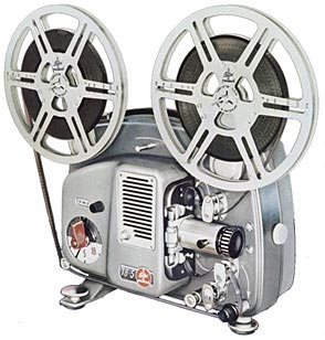
The one that comes closest is the Apple version featured at the top of this post, which kinda-sorta, in a five-beers-into-an-evening-and-feeling-magnanimous way, looks like a Bolex 18-5 regular 8mm projector.
As the Airstream Bambi is to recreational vehicles, so the classic Bolex “toaster” is to domestic film projectors: Born in 1961, round, smooth, shiny, silver, and OMG totes adorbs!
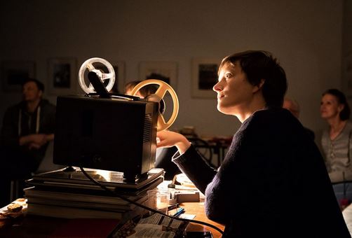
(This lady knows what I’m talking about. She gets it.)
Let’s compare them and talk, first, about what this emoji DOES get right, because I am into positivity:
It’s…not terrible. The feed and take-up reels are the most realistic-looking of any of the emoji projector icons. The feed reel even has something that resembles film on it! The lens is pointed in the right direction, if you’re assuming this is the side of the projector that the operator stands on. The focus ring is the proper cylindrical shape, too, not flared like the lens hood on a camera (as literally all the other versions have it). There are some flourishes like the height adjustment knob that really help sell this icon as being anatomically correct to a passing glance, too.
But compare it with a real Bolex, like the one above, and it’s easy to see that this emoji projector couldn’t possibly work! For one thing, the reel arms are ON THE WRONG SIDE. There is no way that film traveling from the feed reel to the take-up reel would pass between the lamp and the lens on the emoji machine as illustrated. The ventilation louvers would be on the TOP, adjacent to or above the lamp housing (which is absent here), not below it, because…duh, heat rises. The proportions are pretty off, too; the projector body is nowhere near the size it would need to be to house the drive motor and lamp. Lastly, how is there a height adjustment knob and a focus ring, but no on/off switch? What do you run this thing with, The Smart Clapper?
With the possible exception of the Facebook and WhatsApp projector emoji, which get an honorable mention for actually showing — correctly! — the film traveling from feed reel to take-up, all the other emoji projector icons are even more preposterous. All but the WhatsApp one inexplicably depict the take-up reel as being smaller than the feed reel. While it is physically possible to put a takeup reel on your projector that’s smaller than your feed reel, any projectionist will tell you that’s a great way to end up with your last couple hundred feet of film tangled up on the floor. Some of them have the reels just sort of floating in the air, not attached to anything; the ones that have visible arms are at weird angles, and wouldn’t fold in to be flush with the projector body. The EmojiOne and Samsung versions really look like camcorders — not film devices at all, but video ones. (The Samsung reels look suspiciously like EAIJ open-reel video carriers, not film reels, too.) On the EmojiOne and Microsoft icons, the feed and takeup reels actually overlap. At best, they would grind together as the projector ran, which is horrible to contemplate. As to the Google one…not only is it outlandishly proportioned, with an enormous flared lens hood that’s as big around as the larger of the two reels bizarrely floating atop it, like slices of lemon on the edge of a glass of iced tea, but the poor thing is facing the wrong way.
Why do these persnickety critiques matter? Well, for one thing, they tell me the same thing that Dürer’s rhino does: That the person creating this image has never looked closely at one of these creatures in real life. (If we look at the plant or animal emoji clusters or even the food icons in a few years, will those be unrecognizable, too, thanks to accelerating extinction, or a population-wide transition to Soylent-based diets?)
It also affirms that there is a growing distance between analog and digital technologies — one which sometimes leads the latter to make superficial representations of the former. Often, this is in the spirit of homage, or it comes from a desire for footage to “look old” again after archivists have lovingly cleaned and restored it to its best possible state. Other times, it just seems random or lazy. (I loved, and recommend to your attention, Ashley Blewer’s close read of the fake media glitches in Beyoncé’s Formation video.) But while Dürer lacked meaningful access to the exotic creatures of his time, we live in a much more connected age — emoji designers should be able to find plenty of pictures of film projectors to study, even if they don’t have a friendly film archivist near them who can lend them a life model. If you’re an illustrator who wants to help me right this wrong, drop me a line! I’ll hook you up with some beautiful, functional gear to render truthful likenesses from, and we’ll heal this small broken piece of the symbolic world.
Among the many lessons it took more years of college than it should have to sink in, I count learning to read a syllabus as a work of scholarship, and of scholarly authorship, as among the most important. I can point to one professor in particular who helped me see this. They had published relatively seldom since getting tenured, but taught with great dedication. This professor’s syllabi often ran to dozens of pages, and formed (rightfully, I think) the intellectual work of which they were most proud. Those syllabi included not just impeccably formatted reading lists and a week-by-week breakdown of topics and assignments, but concise and comprehensive guides to writing for scholarly audiences, pithy discourses on the core subject matter of the class, detailed descriptions of assignments and their exact delivery parameters, and other elements. The syllabus helped make clear how much effort they’d put into preparing to teach the class–all of which, in turn, tacitly conveyed how much effort we students could expect to put into learning in it.
Prior to that class, a syllabus was just a handout I picked up from the stack by the door on the first day, tucked into the pocket of my five-subject notebook, and checked once a week (usually the night before class, if I’m being honest) to see what the assigned readings were. The syllabus was how I would know if I had to pull a paper or project out of my…ahem, pocket for the next meeting. After that class, I had a new appreciation for what the syllabus could teach me before we’d had a single class meeting: in between those lines, I started to see more of who my professors were, where they might be coming from, and what they might want to give to or get from us as students.
If you’re about to become a student again, especially if you’ve been out of school for some time, syllabi can make for very interesting and helpful reading. (And, unlike many other forms of scholarly publication, you can often access them for free even if you don’t have academic library privileges.) As you evaluate and compare different graduate programs, looking over the syllabi for the core courses and some of the electives that sound interesting can deepen your sense of whether the program will teach you things you want to know, or need to get where you want to go professionally. Reading a syllabus or two can give you a sense of which professors you might want to work with as advisors and mentors, or talk to during a campus visit. I have met very few scholars who wouldn’t perk right up and start chatting if you mentioned you’d read anything they’d written and found it interesting. (We’re human and we have hearts, after all, and much of the time we feel we are just crying into the void.) If you can’t access one of their articles, look for a recent syllabus instead!
If you’re a student now, devote time to reading the syllabus for every class you take, and learn sooner than I did how many things a syllabus can be to you: A road map, a red flag, a portrait of the professor, a guide for future study…the list goes on. One dilemma I talk through a lot with students is how to choose which classes to take. The graduate program I teach in is only two years (which goes by fast). Our university is a large one, our program is highly interdisciplinary, and our students have the option of taking multiple courses outside the department, but course titles and catalog descriptions only convey so much. I always suggest that they look at the syllabus for a class they’re considering if it’s already posted, or email the instructor directly to ask for a copy if it’s not. Professors may be working on their syllabus right up until the last minute, of course, especially for a new class–but they may also have a course outline or draft version they’re happy to share if it helps interest people in the class and ensure minimum enrollment. If you have to choose between two classes you’re keen on–maybe they’re scheduled at conflicting times, maybe you’ve only got one elective slot open this term–having the syllabus for the one you don’t end up taking means you’ve got a reading list for self-study, or the makings of a proposal for an independent study or guided readings with the same professor in a future term, when your calendar’s less crowded, or when you’re better prepared to tackle the advanced content.
Sometimes, you might just be able to tell from looking at the syllabus that a class is not for you. This can save you untold amounts of time and emotional energy. What’s your gut reaction–does it make you curious or fill you with dread? Does it seem like it will be helpful for you to have this perspective on this topic (whether or not you agree with it)? Look at the reading list: dates, authors, article titles, journals, page numbers. Will this be new material for you? And is it new material, period? A course on 19th century literature or medieval systems of law should still introduce you to at least one or two 21st century ideas about those subjects, not just hot takes from the 1980s.
Universities are dynamic environments, so (in my opinion) syllabi ought to be living documents, reflective of that dynamism. I can’t imagine using a syllabus essentially unchanged year after year, when each iteration of a class I’ve taught before offers a chance to refine the readings, retool the assignments, and reflect the current state of our knowledge. There are always new scholars or more timely examples to cite, and tweaks to make for in-class exercises based on the successes of the last time around. (And the failures–because sometimes things just don’t go that well, which is one of the most important ways teachers learn while they’re teaching.) A very good question to ask a professor if you’re talking to them about their syllabus is “What have you changed from the last time you taught this class?”
Looking back on my own syllabi, I’m reminded of the many changes I’ve made from one iteration of a class to another. For instance, I’ve altered course content and classroom strategies significantly just based on who’s enrolled in a particular class. A class of all first-years is really different from a mix of first- and second-years (especially in the fall quarter, when the first-years are just getting on their feet and the second-years are already thinking ahead to graduation). New students need those classic, foundational texts for context, but the more seasoned ones have already read them (and possibly talked them to death already!) in core classes. I’m often on the lookout for “compromise” articles or chapters to assign in these cases–ones that do a good job of summarizing the classic texts with which they’re in conversation, but then move quickly into new territory. When I’ve had a large number of students from other departments or programs, they’ve had similarly varied needs and capacities to take into account. If I know I’ll have an interdisciplinary contingent in a class, I might add “further reading” selections to help fill in foundational knowledge from our program’s core courses, or to help connect the assigned texts to parallel scholarship in their field(s). I’ve also learned that when you increase a class size from one dozen to two or three, the group dynamics will change a lot, and the syllabus might need tinkering to suit. Those “introductions” you do on day one could now eat up a whole hour of class time! Depending on how you plan for students to work together and interact throughout term (are there group projects? service learning components? discussion sections? field trips where carpooling will be helpful?), taking that full hour at the start to get to know one another might be really worth it. On the other hand, you might want to structure and moderate the introductions so they cover only the essentials and move more quickly than conversationally.
Speaking of moderation–although they’re works of scholarly authorship, syllabi aren’t created as standalone works, but as frameworks and stimuli for intellectual exchanges. I’ve learned that conscious framing of readings and other class activities helps students understand why they’re important enough to be on the syllabus. “We’re spending class time on introductions now, and on project check-ins at midterm, because you’ll be paired off for discussion exercises in almost every class meeting, and forming small groups to work more closely together on your term projects. You’ll benefit more from the input and experience of your classmates if you know them better, and I’ll be able to offer you more individually and as a group if I have a sense of where you’re all coming from.” Or “We’re a big group this term, but I want us all to be more than vaguely familiar faces to each other. I’m going to ask each of you introduce yourself with your full name, what department, degree program, or campus unit you’re affiliated with, and one thing that you’d really like to get out of this course. I’ll write those goals on the board as we go–if someone ahead of you says the same thing you’re thinking, you can just tell me to add a plus-one to any of them to save time.” I’ve also started asking, as part of discussions about readings, the simple question “Why do you think I assigned this article/chapter/book/movie/activity for this week?” The answers students have to this question have been really insightful–sometimes revealing connections and underlying course themes that hadn’t occurred to me. And the question itself is a form of critical practice, a reminder that even when there’s an established canon of literature in the field, we still make choices about how we teach and learn from that canon.
Now, after over a decade of teaching classes of my own, my Zotero library has folders for resources related to each class I teach regularly. I can toss new things I run across in there as I encounter them, and add them to the mix when it’s time to teach that class again. (Formatting updated reading lists and putting additional recommended readings up on the course web site is also easy-peasy with a citation manager. If you teach or do research of any kind, and you don’t use a citation manager already, you should.) Other updates range from an ongoing effort to diversify and decolonize the literature I assign and the examples I cite in lectures, to making classroom policies on device use, and even the formatting of the syllabus itself, more inclusive of every kind of learner. Each edition of a syllabus thus reflects that term’s particular grouping of students, the changes in our dynamic profession, and my evolution as an instructor. I even have folders for imaginary classes I’d like to teach someday–each a little seed packet of literature, out of which I’ll eventually cultivate a fully ripened syllabus!
As I continually write and refine syllabi, I have also continued to read them as documents in new and different ways. Teaching as part of an accredited degree program means my syllabi are in conversation with others, and with all the teaching being done across our community of scholars and practitioners. Often, I’m consulting other syllabi as companion works for my own. Knowing what’s come before in sequential courses can help me ensure continuity, or account for shifts in practice over time. I look at my colleagues’ syllabi each quarter to minimize redundancy and reinforce connections between my class and others that might be taught the same term. I also read syllabi for inspiration and ideas. Other people’s syllabi reflect their unique take on a subject–and frankly, it’s easier for me to skim a syllabus and still engage meaningfully with its content than to read a dense journal article by the same author. (Sometimes that’s my cheat if I want to have some basis for interacting with a colloquium speaker or a visiting scholar I admire when I don’t have time to read their latest book. Now you know my horrible secret.) They introduce me to ideas and literature I wouldn’t have found on my own. I’ve borrowed–with permission and acknowledgment, naturally!–the most effective language and useful features I have found in my teaching colleagues’ course documents. I’ve gladly shared bits and pieces of mine in turn, especially with professional faculty who are new to teaching.
And of course, I read them to remember what it’s like: To be a student. To be learning. To be walking into a classroom on the first day, maybe a little bit nervous, but definitely excited. To be getting ready for my future, at least a little bit of which is mapped out on the pages of the syllabus I’ve just picked up from the stack by the door.
During both the recruitment and admissions process for the MLIS program I manage, there are a few questions that come up a lot. One of them is, “Why do I need to take a statistics class?”
I would rather listen to tapes of myself having sex But I am not that dangerous And the C.I.A. is not that creative
—Steve Gregoropoulous/W.A.C.O.
(from the album Darling Clementine)
These old song lyrics come to mind every time I’m signing the waiver form giving permission for a conference session I’m part of to be recorded or livestreamed. “Record away!” I think, “Just as long as I never, ever, ever have to watch it myself.” And yet…how else can we ever know what we really look like when we’re talking about our work? Continue reading →


 As I thought about what I would want to say in this venue, and how national origin and being from somewhere in particular is one of the things that still dictates whether or not one could participate in our community of practice, it seemed the me that we are, together, writing a new chapter in this history. We may be trying to move beyond the national, or perhaps to become a nation of our own—not foreign, as Cook would have it, but familiar, and familial.